MEASURES OF CENTER - HISTOGRAM
Median, Mean, and Mode of data
March 13, 2021
When we have a large data set, it is not practical to use the stem and leaf diagram, we have to use another type of data display: a histogram.
A histogram looks like a bar chart. It plots the shape of numeric measurements, without gaps between the bars. We split data into groups, also called bins or classes. Unlike the stem and leaf diagram, a histogram does not show individual data values. However, we know the number of measurements or observations, also called frequencies, in each bin. A bar’s height shows frequencies, and the width, also called bin width, covers a range of measurements.
The heights (mm) of a different variety of plants are as follows.
65, 32, 40, 27, 35, 49, 53, 33, 47, 56, 45, 30, 48, 67, 56, 37, 56, 41, 38, 52
Let’s draw the histogram. In this example, the minimum is 27 and the maximum is 67. We will choose a bin size of 9, and have five of them, 27-36, 36-45, and so on. First, we will split the data into the five bins, and the frequency distribution table will be constructed, which is then used to draw the histogram. The frequency table for the above data, is shown below:
| BIN | VALUES INCLUDED | TALLY | FREQUENCY |
| 27-36 | 27,30, 32,33,35 |
IIII
/
|
5 |
| 36-45 | 37,38,40, 41 |
IIII
|
4 |
| 45-54 | 45, 47,48,49,52,53 |
IIII I
/
|
6 |
| 54-63 | 56, 56, 56 |
III
|
3 |
| 63-72 | 65, 67 |
II
|
2 |
The histogram can graphically show the center of the data. In other words, the shape of a histogram provides us with information about the mean, median, and mode of the data.
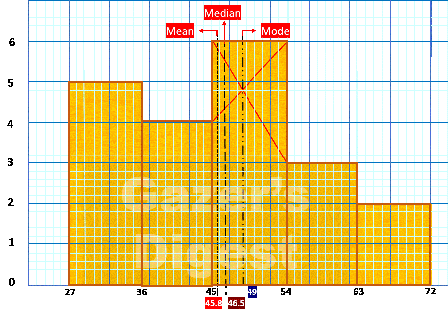
| MEAN | MEDIAN | MODE |
| 45.8 mm | 46.5 mm | 49 mm |
Gazer’s Digest is an online, information sharing, platform.Gazer’s Digest includes topics, thought to be useful for the readers.

© 2021 Gazer’s Digest.